All ranking factors are created to achieve one thing:
A better user experience.
Google wants its users to land on sites that are:
- Functional
- Easy to use
- Informational
If your site can’t offer that, then…
Don’t let the door hit you on the way out.
Today, we’re going to audit your site’s user experience to see how you stack up.
User Experience: What You’re Looking For
In this test, you’re going to use your site as an actual person would.
You want to make sure everything looks, loads and works correctly on:
- Mobile (because of mobile-first indexing)
- Desktop
For example…
When I went through my site on my phone I came across this formatting problem with the pink image:

And after scrolling down:
I found this recurring glitch with every header:
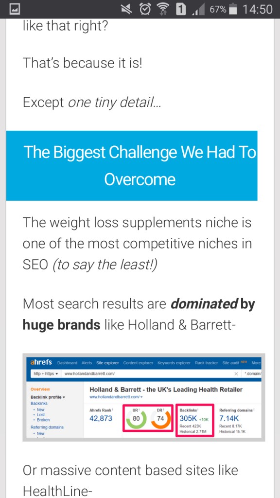
These may seem like minor details.
But one of Google’s priorities is user experience.
Anything that hinders user experience can negatively affect your rankings.
We’re going to go through your spot check URLs to take note of any user experience problems you can find.Most of these can be done visually, but it’s important to check any interactive sections also work.Here are the 11x questions you need to answer……does the text formatting look right?

….does the image formatting look right?
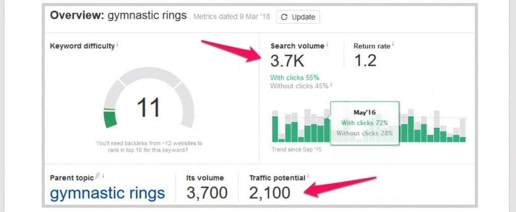
…do tables (and similar) look right?

…do your social sharing buttons display correctly, or do they overlap your content?
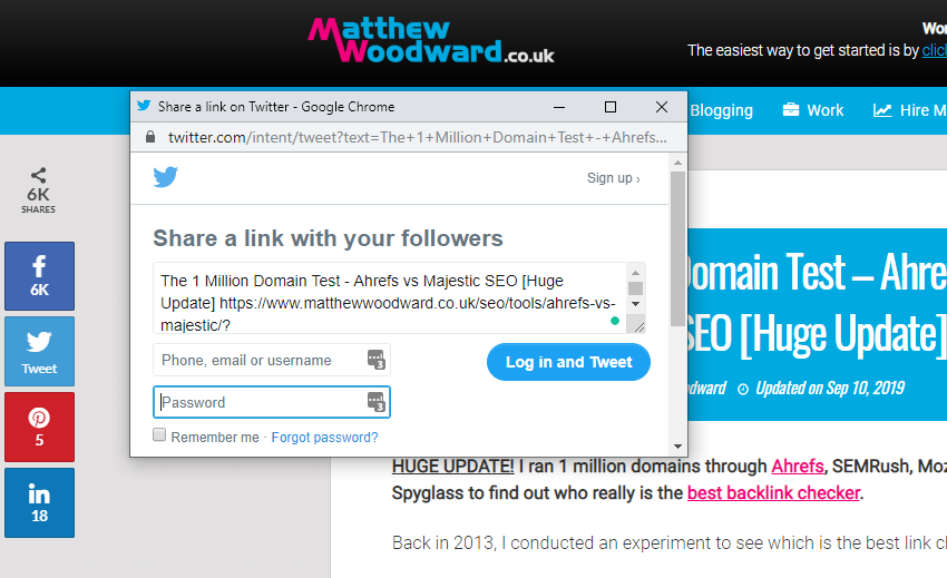
…do those social share buttons work?
…do videos play?
…do your pop-ups load and if they do, are they blocking access to your content on mobile?

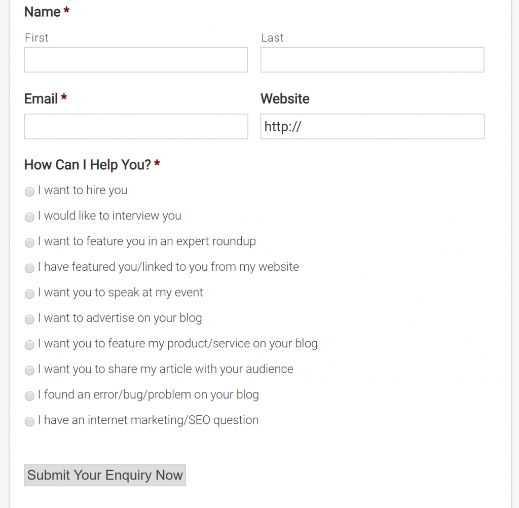
…do your contact forms work?
…do your links work?
…do any special functions – like social lockers – work?

..do you have more than 1x ads above the fold when your page loads?
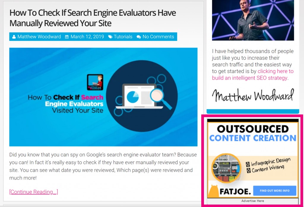
(If so you may trigger a page layout penalty.)
Test each of your 5x spot check URLs.
You’ll need to run through the tests for each URL on both mobile and desktop for a complete view.
In the perfect world though, you will have someone else do this for you because quite often we can’t see the woods for the trees.
Just add your pass/fail mark to the sheet…
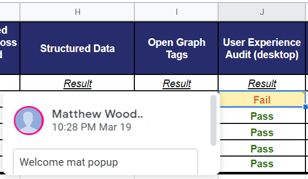
…including any errors you find in a comment box.
Final Thoughts…
One of the biggest problems people often bump into here is how Google have changed their relationship with popups.
Especially popups that block content and interrupt the user experience however this was the “done thing” for quite a number of years.
So pay attention if you are currently doing that to mobile visitors – instead you should use compact CTA bars rather than full screen popups.
And I know it’s tempting to fix these issues immediately.
But there is one more test to go before we can start fixing things…